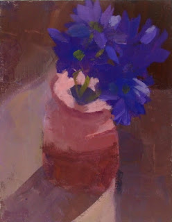
This painting isn't quite a standard size (slightly less than 6x8"), because it is on a masonite board that was cut to size at home, and apparently when you take a large piece of masonite and cut it into a bunch of smaller boards, the end ones are going to end up slightly smaller. I've been told. Anyway, I am wanting this to be slightly even smaller at the bottom, because think it would be a better composition that way. I'm going to have the same sawer saw some off as soon as other projects around the house are finished and the table saw becomes available for art cropping (unless someone out there knows for a fact that sawing a completed acrylic painting on masonite is a bad idea and lets me know). Here's how I would rather this look:
It's slight, but I think it makes a difference.
You can see that the ellipse at the top of the vase (BTW, same vase as yesterday's painting) is kind of off, tilted. You know what? That doesn't bother me. I have decided that I am not after perfection in the drawing, because I think having some things a little off gives the painting some life.
I like the sense of light in this one, and my main interest in painting is to capture a light effect. Whether painting still life, landscapes, or people, that is what I am interested in. I have so much to learn about painting light. Lighting a still life has been a big learning challenge, because of wanting to have a nice light effect without harsh shadows. I've done research and experimented, but if anyone can direct me to any reference information on this topic, I would be so grateful.
So far, natural light on the still life when the light is at certain angles gives me more of the effect I want....but then I have the same issue painting still life as with painting plein air--the light CHANGES! It's pretty interesting over a painting session to watch the light change--you see all your light and shadow effects disappear and reappear in other places. But it makes it hard to complete the original vision of the painting. At least in the amount of time I need to do one of these paintings.
For the light effect in this painting, I think I lucked out in finding these purple flowers and being able to pair them with my peachy-colored vase. I think being sort of complementary colors, they helped make the light effect on the vase pop. Then again, I am not a trained artist, so maybe I am making that up. But I do think from my readings on color that these are near complements and that having them together did help give a sense of light. I'm happy to hear from any artist out there who can tell me if I am making sense!
Photos. First, I want to acknowledge my friend Dixie for letting me use her art photo shooting set-up. Without access to Dixie's set-up, I would not have this blog on-line yet. So, thank you SO much, Dixie. Secondly, I want to say that the photos for this post and the prior two were done by me, alone with the photo-shooting set-up, without Dixie there. For the first three posts' photos, Dixie was there. One thing we know that made a difference is that she had one extra light on that I didn't use. When I look at the photo from this post and the last two compared to the first few, the first few look more accurate to the paintings to me. So, I'll need to try that extra light from now on. Or maybe actually having Dixie there made all the difference...


4 comments:
Once again I am in awe of your painting and the amount of things you know about art. I don't remember your loving art as you were growing up and you show me that being a lifelong learner is possible and a very good thing in so many ways.
ME
I'm with you -- I like the cropped one much better. The difference amazes me. Love the blog. :)
Stefanie
Beautiful!!
My favorite painting...so far!
Post a Comment